Typeface / Experimental Design
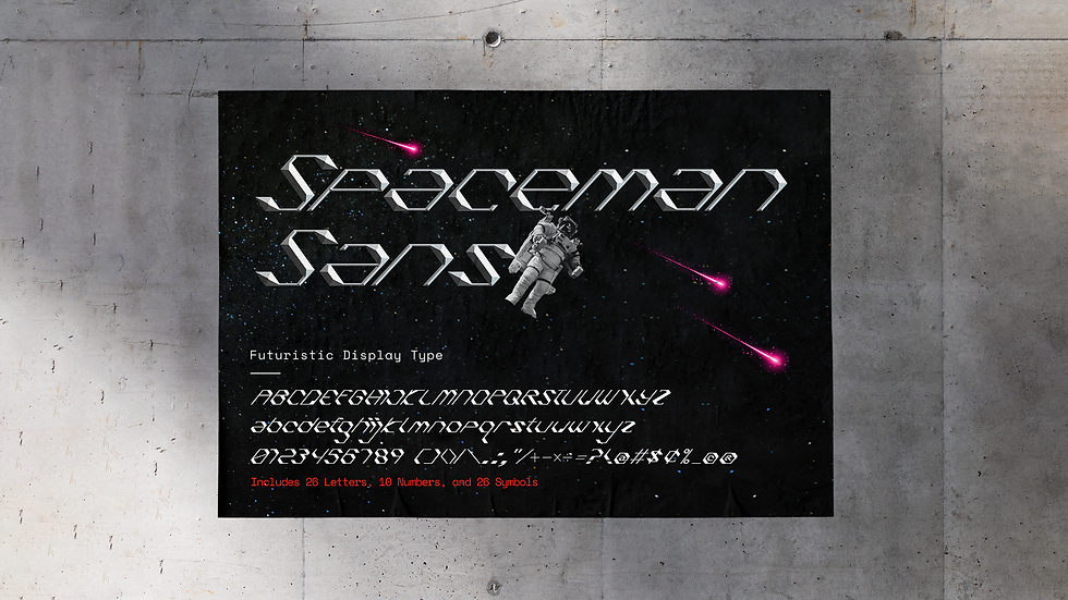
Spaceman Sans
Project Overview
Year: 2023
Self-initiated project
THE CHALLENGE:
Spaceman Sans is a self-initiated typeface design project. The design was adapted and inspired by the original custom type featured in my 78th poster design on Instagram.
From the very beginning, I envisioned an ultra-clean and ultra-minimal display type that looks and feels futuristic with high-tech stylistic elements.
THE SOLUTION:
I explored various slants, curves, thicknesses, and angles to achieve this. The end result is a "minimal yet maximal" type design that is clean, bold, and modern, yet with a distinct maximalist sci-fi aesthetic. Each character is designed with slanted angles and sharp corners to reinforce the high-tech and modern aesthetic. Collectively, all the characters come together to form a solid industrial-style typeface that is suitable for a wide range of modern creative applications.
Included in the typeface are 26 letters, 10 numbers, and 26 symbols.
Check out Spaceman Sans on the Gumroad eStore ↘
View the full case study on Behance ↘